Analyzing the Graph of a Polynomial

In pre-calculus, we investigate many topics in the subject, one of which is graphing polynomials.

Above is the graph of the equation (x-2)/(x2-2x-8). Using the graph, we can analyze many characteristics of the polynomial. First, we can identify the y and the x-intercepts, when x and y equal zero, respectively.

We can also recognize the vertical asymptotes, which is the value of x that the graph never touches. In this case, the vertical asymptotes are when x equals to -2 and 4. We can also describe the behavior of the graph as x approaches the vertical asymptote from different directions. For instance, as x approaches -2 from the negative side (left), y approaches negative infinity (-∞), and as x approaches -2 from the positive side (right), y approaches positive infinity (+∞).  The same behavior applies to when x approaches 4 from both directions.

The horizontal asymptote can also be found using this graph. As seen above, the graph never touches the point y equals 0. The behavior of the graph can be observed as y approaches zero from the negative (below) and positive (above) side. In this case, as y approaches zero from below, x approaches -∞ and as y approaches zero from above, x approaches +∞.

Unit Circle | Math

As SAT test date is approaching, I practiced both the math and verbal section frequently. A topic in SAT that I learned was the unit circle. This topic is a foundation to the idea of calculus. I’ll be taking pre-calculus class for the rest of the school year so this will be helpful.

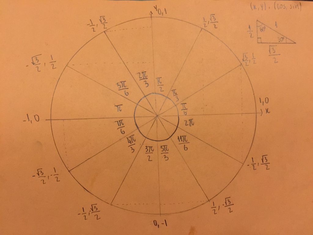
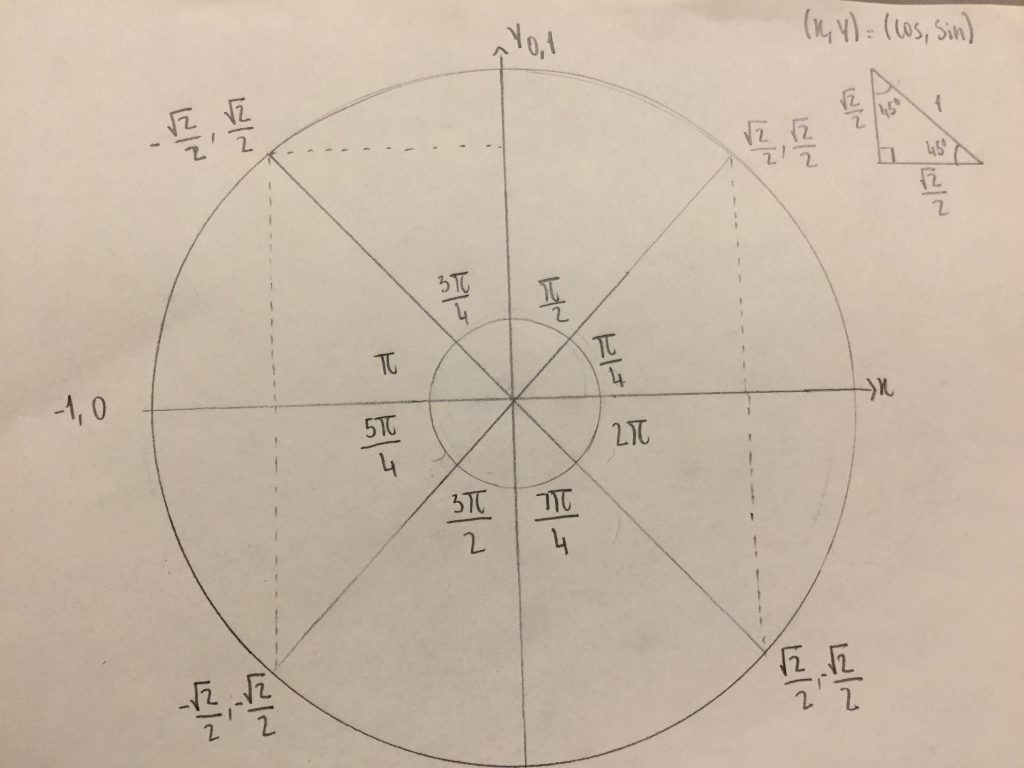
A unit circle is a circle with the radius of 1. This circle helps us understand and calculate the angles and lengths of special triangles — 30-60-90 and 45-45-90 triangles. In other words, the unit circle is made up of special triangles.

Below is a drawing I made that explain unit circle.

Unit Circle with 30-60-90 triangle
Unit Circle with 45-45-90 triangle


AP Statistic Response Practice

The AP Statistic exam is in about four months, so part of what we do in class is practicing writing response for the actual test. Below is a sample question and my response to it. (a). The scatter plot support the newspaper report that states the more semesters needed to complete an academic program, the greater the starting salary in the first job. The scatterplot shows a moderately positive linear association, meaning the more semesters needed to complete a program, the more starting salary earned.

(b). The slope of the least-squares regression line is 1.1594. This means for every additional of semester needed to complete a program, there will be an addition of about 11,000 euros to the starting salary.

(c). For the business majors, the scatterplot shows a strong negative and linear association between the number of semesters and starting salary. This means the more semesters needed to complete an academic program, the less the starting salary earned.

(d). The median starting salaries vary among the three majors. Business majors have the lowest median starting salaries in thousands (36-38), followed by physics majors (48-50). Chemistry majors have the highest median salaries in thousands (54-56).

(e). Based on the analysis of the independent researchers, the newspaper report could modify to say that within each major, the more semesters needed to complete an academic program, the lower the starting salary earned in the first job. The major with the highest starting salary is chemistry, followed by physics and then business.

Advanced Placement Statistic

This year I take Advanced Placement (AP) Statistic course as math essential. Personally, I think statistic is the most applicable subject in math. We can relate our everyday life with statistic. For example, we can see how weight is associated with height by doing statistical analysis.

An example of the content in AP Statistic book